Default Themes: When editing the Main Theme Default will follow the notes below. If
you are editing a secondary theme (not set in Portal Settings as your Global Theme),
the “Default” option will follow the notes below unless you have the Use Global Theme for Defaults toggle enabled
at the top of your theme. If that toggle is switched to ON, Default options in your Theme will follow the settings
chosen for your Main Theme.

Brand
This section allows you to customize the branding, logos and search result descriptions for your portal. Logo - upload a logo image (.jpg, .gif, .svg, or .png format) for your homepage and menu bar Logo Padding - adds padding to your logo image. By default, adding padding to one side adds an equal padding to all sides, but this can be unlocked for independent padding on all sides as well. Favicon - upload an icon to be used in browser tabs and location bar (.jpg or .png format) Portal Description - Adds a <meta> tag or description for search results if your portal will be searchable via search engine. Default Preview Image - upload and add a default preview image to search results and copied/embedded links. App Icon - Upload an icon that will be used on the home screen when someone bookmarks your portal on a mobile deviceHome
You can add and control the behavior of your Portal’s homepage from this section Homepage - This controls the content displayed on your portal’s homepage. You can choose a created home/landing , show a specific or random dashboard, or employ a redirect. By Default, Curator’s default homepage is chosen. Homepage Page - When the Homepage Type is set to “Page” or “Default,” use this option to choose the page you display as your portal’s Homepage. Redirect Location - When the Homepage Type is set to “Redirect,” use this option to set the URL for your homepage to redirect to. Curator Home Title [Meta Tag] - add a meta tag here to be appended to the homepage for SEO and link previews in search engine results.Global
Main Body Background Color - Sets the background color for the main body of the site. This control impacts pages, dashboards, and forms throughout the site. Background Image - Ad an image instead of a solid background color to your portal. This will also impact pages, dashboards, an forms throughout the site.Search Options
*Note: (Search must be enabled in Portal Settings to utilize these options) Search Icon - Upload a custom icon for search on your portal. This icon will appear in the menu/navigation bar of your portal when search is enabled. The default icon is a magnifying glass. Search Result Background Color - Sets the color for the background of search results from the menu/navigation search bar. Search Result Text Color - Sets the color for the text of search results from the menu/navigation search barAlerts Options
- Flash Error Text Color - Sets text color for flash error messages
- **Flash Error Background Color **-Sets background color for clash error messages (default is red)
- Flash Info Text Color - Sets text color for flash information messages (informational notices, etc.)
- Flash Info Background Color - Sets background color for flash information messages (default blue)
- Flash Success Text Color - Sets text color for flash success messages (slide capture, form submission success)
- **Flash Success Background Color **- Sets background color for flash success messages (default is green)
- Flash Warning Text Color - Sets text color for flash warning messages
- Flash Warning Background Color - sets background color for flash warning messages (default is yellow)
Loading Bar Options
- **Loading Indicator Color **- Sets color for loading bar across the top of a page when it is loading inside the portal
Mobile Settings
- Mobile Width - Sets the screen width (in pixels) that triggers the portal to change from desktop to mobile view
- Device Layout Override - When enabled, allows you to manually input screen size trigger for both tablet and mobile layouts for dashboard rendering.
- Override Tableau Container Size on Mobile/Tablet - When enabled, resizes the Tableau embed container to fit the viewable screen area on mobile and tablet devices. This affects only the Curator container, not the Tableau Dashboard itself. Only visible when a Tableau connection is configured.
Fonts
This section allows you to control the font family(ies), weight, size, and color throughout your portal. The top section controls the default, and each sub-section allows you to further customize the fonts for different areas and uses inside the portal.Menu
This section allows you to control the navigation section of your portal, including the menu your portal will use. Menu items can be added and edited in the Navigation section of the portal. Menu Dropdown - Allows you to choose the Menu to use in your portal. The option you choose here will be the highest level of the menu and all navigation items nested underneath will show in your portal’s navigation bar. Navigation Type - Controls the location and format of the menu bar in your portal. You can choose between Top Navigation, Side Navigation, and Mega Menu. The Default option is Top Navigation. Examples of these options are located in the Titles & Toolbar section. Hide Menu on Scroll - When enabled, the navigation bar automatically hides when the user scrolls down and reappears when they scroll back up. Options are Off and On. Default is Off. This option is available when Navigation Type is set to Top Navigation or Mega Menu. Navigation Background Color - Controls the background color of your menu bar/navigation Navigation Text Color - Controls the color of the Text in your menu bar/navigation Navigation Highlight Color - Controls the color of the of a highlighted menu item. This option also controls the color for the text on Menu Breadcrumbs for side navigation that can be enabled under Theme > Titles & Toolbar > Enable Menu Breadcrumbs.Menu Styles
- Navigation Alignment - Sets whether navigation items align to the right or left. Default is Right-aligned.
- Menu Height - Allows you to set the height of your menu/navigation bar in pixels
- Drop Shadow - Allows you to turn on or off the shadow for your menu/navigation bar.
- Navigation Border Width (px) - Allows you to set the width of the border on your navigation menu/bar
- Menu icon size - when you elect to add a menu icon, this control allows you to choose the size of the icons next to your menu/navigation items. Options are small, medium, and large.
- Menu icon spacing - Sets the distance between a menu icon and its label in pixels. The default distance is 2 pixels.
Menu Text Options
- Top Level Menu Font Transform - Allows you to transform the top level menu font. Options are Default, None, Capitalize, Uppercase, Lowercase. Default is no transformation.
- Top Level Menu Font Style - Sets font style for top level menu items. Options are Default, Normal, Italic, Oblique. Default is Normal style.
- Top Level Menu Font On Hover - Allows for Top Level Menu Items to be Underlined on hover. Options are Default, Normal, and Underline. Default is Normal/Not Underlined
- Drop Down Font Transform - allows you to transform the dropdown/sub items menu font. Options are Default, None, Capitalize, Uppercase, Lowercase. Default is no transformation.
- Drop Down Font Style - Sets font style for dropdown menu items. Options are Default, Normal, Italic, Oblique. Default is Normal style.
- Drop Down Font on Hover - Allows for Dropdown Menu Items to be Underlined on hover. Options are Default, Normal, and Underline. Default is Normal/Not Underlined
Menu Color Options
- Top Level Active Item Color - Sets the background color for the active top-level menu item. Default is Black
- Top Level Active Item Text Color - Sets the text color for the active top-level menu item. Default is white.
- Dropdown Background Color - Sets the background color for the dropdown menu items. Default is Black.
- Dropdown Text Color - Sets the text color for the dropdown menu items. Default is white.
- Dropdown Hover Background Color - Sets the background color for dropdown menu items on hover. Default is black.
- Dropdown Hover Text Color - Sets the text color for dropdown menu items on hover. Default is white.
Mobile Menu
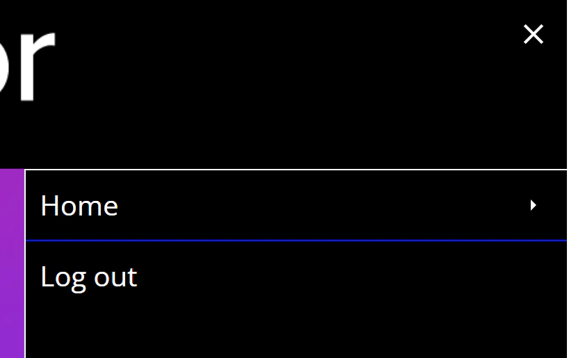
The mobile menu is triggered under the default settings when the browser window reaches 1025 pixels wide. You can adjust the window width for triggering the mobile menu in the Themes editor under Menu > Mobile Settings > Mobile Width.- Side/Mobile Navigation Trigger Color - Sets the color for the mobile menu trigger (hamburger menu and ‘X’). Default is white.
- **Mobile Navigation Background Color **- Sets the background color for menu items in the mobile menu. Default is black.
- Mobile Navigation Text Color - Sets the text color for menu items in the mobile menu. Default is white.
- Mobile Navigation Active Item Color - Sets the background color for the active menu item in the mobile menu. Default is black.
- Mobile Navigation Active Item Text Color - Sets the text color for the active menu item in the mobile menu. Default is white.
- Mobile Navigation Underline Color - Sets the color for the dividing line between mobile menu items. Default is white (set to blue in example below).
Titles and Toolbar
Title and Toolbar Location - Defines where content titles and toolbars should be located within your portal. Options are Default, Top of Page, Inside Top Nav, Beneath Top Nav, and Side Toolbar & Title Top of Page. Default is Top of Page. Examples of these options are located in the Titles & Toolbar section.Title Display
- Hide All Titles - Allows you to hide titles across every page type. Options are Default, Show, and Hide. Default is Show.
- Hide Dashboard Titles - Allows you to hide or show titles across Tableau and Sigma Dashboard Pages and Power BI Report Pages. These are dashboards and reports brought in directly from your analytics platform. Options are Default, Show, and Hide. Default is Show.
- Hide Page Titles - Allows you to hide or show titles across all Page content. Options are Default, Show, and Hide. Default is Show. Note - this option can be overridden on a page-by-page basis using the Show Title toggle in the page editor.
Toolbar Styles
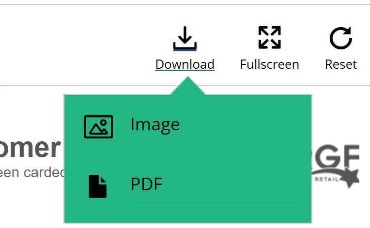
- Hide Action Titles - Allows you to show or hide the text/title under Action buttons on the Dashboard toolbar (Tableau Dashboards only). Options are Default, Show, and Hide. Default is Show.
- Action Button Size - Sets the size of Toolbar action buttons. Options are Small, Medium, and Large. Default is Large.
- Enable Menu Breadcrumbs - When enabled, shows breadcrumbs in sub-navigation that reflect menu item hierarchy (Side Navigation only). Options are Default, Off, and On. Default is Off.
Toolbar Colors
-
Subnav Background Color - Sets the background color for toolbar sub-navigation items. Default is white. Color is set to green in example image below.
- **Subnav Text Color **- Sets the text color for toolbar sub-navigation items. Default is Black. Color is set to default in example image above.
- **Action Button Color **- Controls the color of Action Buttons and text/titles on the toolbar. Default is black. Color is set to black in the example image above.
- Accent Color - The accent color applies to elements in Custom Views, Dashboard Export, Report Builder, Tutorials, Org Charts, Explorer Elements, Favorites, Dashboard commenting, Scorecard, and New and Updated flags. It is recommended to use a distinct color (not white or black) to indicate users are able to click on these elements to perform an action. The accent color also applies to buttons within the toolbar for Dashboards. The default color is white.
- Accent Text Color - Sets the text color for accent-button elements. The background color of these elements is generally controlled by Accent Color. Ensure that the Accent Color and Accent Text Color have sufficient contrast to make the text visible. The accent text color also applies to buttons within the toolbar for Dashboards. The default color is black.
Toolbar Mobile Settings
- Toolbar Mobile Background Color - Sets the background color for the slide-out toolbar when in mobile view. Default is White.
Dashboards
Dashboard Full-Screen Margin - Sets the left and right margins (in pixels) for fullscreen-width dashboards. This setting will apply only to dashboards that take up the full width of the screen and are set to ‘range’ or ‘automatic’ sizing.Dashboard Tabs Styles
- Default - These controls set the background, text, and border color for dashboard tabs when enabled. Default for tab color is white. Default for text color is black. Default for tabs border color is black.
- Active - These controls set the background, text, and border color for the active dashboard tab when enabled. Default for tab color is black. Default for text color is white. Default for tabs border color is black.
- Hover - These controls set the background, text, and border color for the dashboard tabs on hover when enabled. Default for tab color is white. Default for text color is black. Default for tabs border color is black.
Metrics
This section controls metrics chart and background colors for Tableau Metrics when in use within the portal.Pages
This section allows you to set default colors, styles, and options for tiles, tutorials, buttons, margins, and form styles across your portal. Thumbnail Tile Style - Sets the default shape of tile elements across the Curator portal. Options are Default, Square, Landscape, Boxy, and Hex. Default is Square. Note - The default tile style can be overridden on an element-by-element basis in the Edit Page section of the backend. more information. More information can be found in the Tiles section. Tile Text Color - Controls the color of Text below tiles across Curator. The default is black. Button Shape - Sets the default shape for buttons in your portal. Options are default, square, rounded, pill, and oval. Default is Square. **Hyperlink Color **- Controls the hyperlink text color inside buttons. The default is black.Tile Styles
- Tile Background Color - Controls the background color for tiles. Default is white.
- Tile Overlay - Gives the ability to add a description or action buttons on hover for tiles. If the “Show Tile Description” control is set to ‘On Hover,’ the Action button option will not be shown. The default setting is None.
- Show Tile Description - Shows Description for tiles - description will only show for content that has a description added. Options are Default, Do Not Show, On Hover, and Below Tile. Default is to show the description on Hover.
- Show Tile Title - Controls the default setting for showing Tile titles across Curator. Options are Default, Show, and Hide. Default setting is to show titles.
- **Custom Default Thumbnail **- Enables you to add a custom ‘default’ thumbnail for tiles where a thumbnail is not set within the content itself. If a file is not uploaded here, Curator will use its own default thumbnail for content where there is not a custom thumbnail, or when dashboard thumbnails cannot be retrieved.
Tutorial Styles
-
Tutorial Title Text Color - Controls the Color of the Title Text for Tutorials
Button Options
- Primary Buttons - Submit buttons on forms, Close/Close and Do Not Show Again Buttons on Tutorials, Button elements on pages set to “Primary” under the Button Settings section will use these color settings.
- Primary Button Color - Sets background color for primary buttons across the Curator portal. The Default setting is White.
- Primary Button Text Color - Sets the text color for primary buttons across the Curator portal. The Default setting is Black.
- Primary Button Border Color - Sets border color for primary buttons across the Curator portal. The Default setting is Black.
- Secondary Buttons - Button Elements on Pages set to “Secondary” under the Button Settings section will use these settings
- Secondary Button Color - Sets background color for secondary buttons across the Curator portal. The Default setting is Black.
- Secondary Button Text Color - Sets the text color for secondary buttons across the Curator portal. The Default setting is White.
- Secondary Button Border Color - Sets border color for secondary buttons across the Curator portal. The Default setting is Black.
- Cancel Buttons - Clear and Cancel buttons on forms
- Cancel Button Color - Sets background color for Cancel buttons across the Curator portal. The Default setting is White.
- Cancel Button Text Color - Sets the text color for cancel buttons across the Curator portal. The Default setting is Black.
- Cancel Button Border Color - Sets border color for cancel buttons across the Curator portal. The Default setting is Black.